Brand
Logos, banners and colours.
Everything here is generated from the same tokens the website uses, so a change to the palette changes every asset on this page. Right-click and save, or link straight to the URL.
The mark
An infinity loop with something travelling round it
One continuous path, no text, so it renders identically everywhere. Use this alone at small sizes. Below about 32 pixels the wordmark stops being legible and the mark does not.


Using it
- Keep clear space around it of at least the height of one loop.
- Recolour it by changing the two stroke values. Both, not one.
- Never put a gradient on it. The site has exactly one gradient and it is behind hero sections.
- Never add a drop shadow, an outline, or a container it does not need.
- Never stretch it. The two lobes are circles and it shows immediately.
- On a photograph, use the reversed version on a solid green plate rather than over the image.
Ready to use
Sized for where they are going
Each one is drawn around the part of the frame that platform covers with something else, which is the reason a banner designed in the abstract ends up with the wordmark under a profile picture.
Profile picture
X, LinkedIn, GitHub, anywhere a square avatar is asked for.
Every platform crops this to a circle. The mark sits well inside that circle rather than filling the square.
avatar.png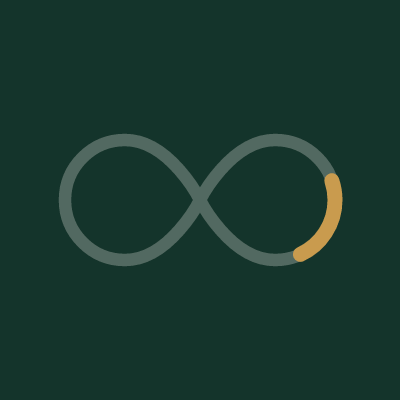
Profile picture, light
The same, for anywhere that puts avatars on a dark interface.
Cropped to a circle in the same way.
avatar-light.png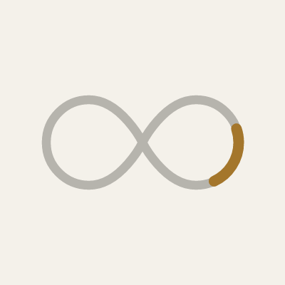
X header
The header image on an X profile.
X overlays the profile picture bottom left and crops the top and bottom on narrow screens. Everything here sits in the middle band, right of the avatar.
x-banner.png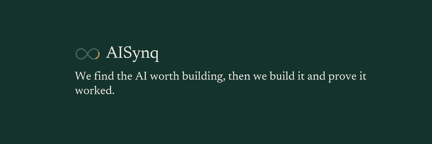
LinkedIn company banner
The cover image on a LinkedIn company page.
Short and wide, and LinkedIn crops the sides on mobile. One line only, centred, nothing near the edges.
linkedin-banner.png
LinkedIn personal banner
The cover image on a personal LinkedIn profile.
The profile picture covers the lower left quarter on desktop and more on mobile. Content sits right of centre.
linkedin-personal.png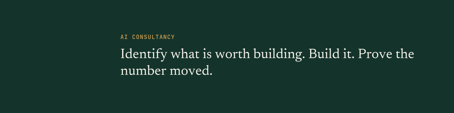
Colour
Two greens, one brass, and a warm ground that is not white
Every pair of these that carries text is verified against WCAG AA in both themes by a build gate. Adding a colour means running it.
Deep green
The brand colour. Panels, buttons, avatars.
Deeper green
The closing block and the footer only.
Warm bone
The default page ground. Not white.
Brass
Large figures, rules, the travelling arc in the mark.
Brass, body size
Brass at text size, where the lighter one fails contrast.
Brass on green
Brass on a dark ground, where it has to lift.
Ink
Body text on light grounds.
Muted
Secondary text, captions, metadata.
Type
Three families, and each has one job
Aa
Newsreader
Headlines only. It is the one that renders the largest element on most pages, and the only font preloaded.
Aa
Switzer
Everything a person reads at length. Body copy, navigation, buttons, forms.
Aa
JetBrains Mono
Figures, dates, reading times, and nothing else. If it is a sentence, it is not this.
All three are self-hosted from src/fonts. For a deck or a document where they are not installed, Georgia substitutes acceptably for Newsreader and any grotesque for Switzer. Do not substitute the mono.
What is not here
There is no icon set, no illustration style and no photography direction, because none of those exist yet. A brand page that showed placeholder versions of them would be inventing a system nobody has decided on, and somebody would use it.
The mark is also a starting point rather than a finished identity. It replaced a gradient logo that used the three most common symbols in AI branding at once, and it is deliberately plain. If a full identity is commissioned later, one file changes and every asset on this page changes with it.
Need something not on this page? Ask, and it gets added here rather than sent as an attachment that goes out of date.